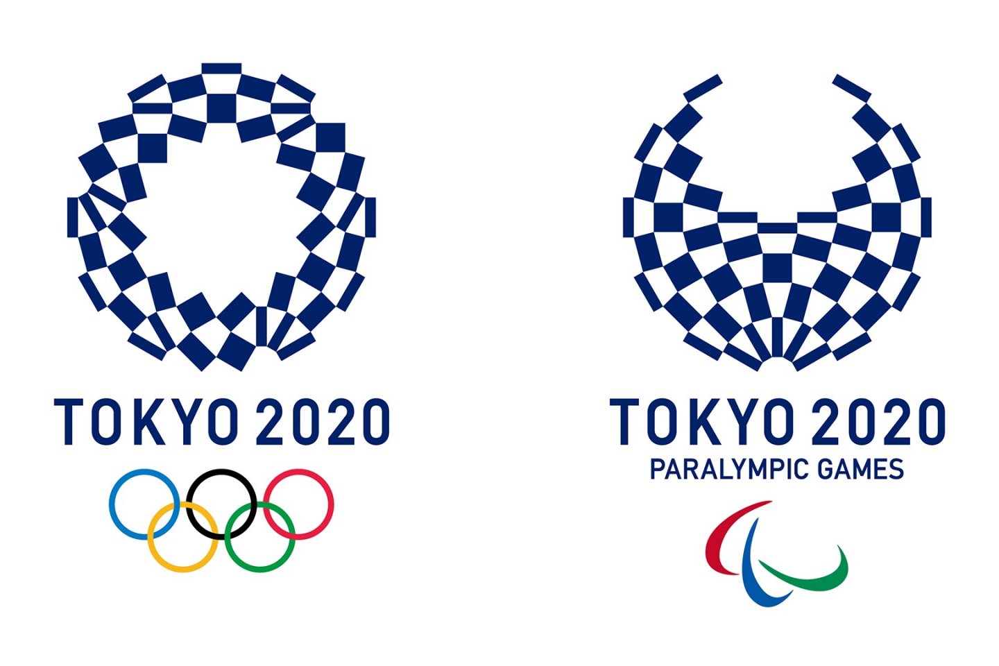
Editor's note: With confidence in the original logo quickly evaporating, a new logo was unveiled in April 2016, which we also show here. Otherwise this article references the first logo's unveil.
The summer games of the XXXII Olympiad have never felt closer. While the design of the National Olympic Stadium has gone back to the drawing board (literally) the emblems of the Olympic and Paralympic games have been revealed. At a special release party in Shinjuku’s TMG Plaza, the vice-president of the International Olympic Committee and a representative of the Paralympic committee appeared alongside top Tokyo officials to introduce the new emblems. Short speeches preceded a light-and-music show before the designs were revealed.
Both emblems share the same design, with inverted color scheme. The Olympic emblem suggests a 'T'-shape with a symbolic "Rising Sun" element. The 'T' denotes Tokyo, tomorrow, and team. The Paralympic emblem, while containing these same features, also mimics an “=” mark as a sign of equality.
Tokyo's preparation may have been hindered by the National Stadium plans, but these new emblems provide a fresh design and new tone for the games. Moreover, the emblems create a new momentum for Tokyo, and the world, to rally behind. Here's hoping the XXXII Olympiad will be one to remember.
What are your thoughts on the new emblems? How do they compare to designs from former games? Comment below!


