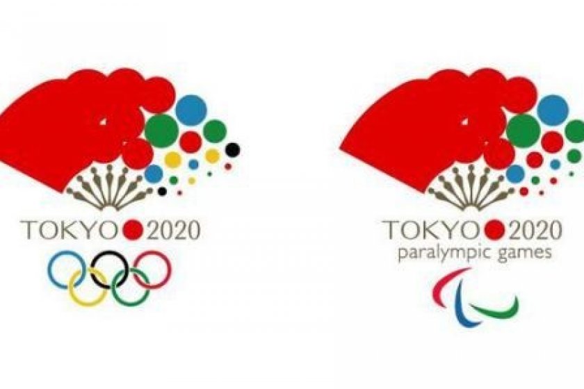
In light of recent news surrounding the origins of the official Tokyo 2020 Olympics logo, a new proposed logo has been stirring the hearts of many.
The new logo, proposed by a Japanese graphic designer and percussionist currently residing in Seville, Spain, has been so well-received that many have asked to make this logo a reality.
Commenting on his design, the graphic designer, who goes by the alias @vivakankan on Twitter, has commented that the folding fan element of the logo 'symbolizes good omens in the way it spreads out', and has been a tool 'used to cheer others on since ancient times'.
"I believe it’s the best design for an Olympic motif and it perfectly captures the Olympic quality of harmony. The theme of ‘Japan (the red suns) being supported by many peoples’ is also represented in its design", he said.
User reactions to the design include, "It’s unexpectedly good. Let’s go with it!” to “You can instantly tell it’s Japan when mixed in with a bunch of other past Olympic logos.”
Seems like this logo would certainly be the way to go!


